Product thinking and discovery
Usability testing
Give realistic tasks, ask people to think aloud and do not help until they are stuck. About five users find most issues in a given design; then fix and retest.
Interviews validate problems and context. Usability tests validate whether people can use a solution (prototype or production). Give realistic tasks, not a tour. "Find the invoice for Acme and mark it as paid" beats "click around and tell us what you think."
Use think-aloud: ask them to narrate what they are looking for and what they expect. Do not help until they are stuck — and note where you wanted to help; that is the design bug. Avoid defending the design in-session; fix later.
The big idea
Why about five users? Nielsen Norman Group popularized the finding that the first several users uncover the majority of usability issues in a given interface; returns diminish after that for the same design. You are not estimating population parameters; you are finding enough friction to fix before the next iteration. Run another five after you redesign. Five is not magic for market validation — problem interviews and quantitative data still matter.
Measure roughly: task success (yes/no), time on task, where they hesitate, severity (blocker vs annoyance). Pair with qualitative "I was looking for X here."
Trade-off
Guerrilla tests (coffee shop, hallway) are fast and cheap but skew toward convenience samples. Recruited tests with your ICP are slower and more expensive but catch domain confusion you will never see from random people. For specialized B2B workflows, prefer recruited; for consumer onboarding clarity, guerrilla can be enough for a first pass.
Surveys scale. They are weak at discovering unknown problems and strong at sizing known ones ("how often do you export CSV?") or tracking satisfaction over time (CSAT, NPS — with caveats). Pitfalls: leading questions ("How much do you love the new dashboard?"); hypotheticals ("Would you pay $20?"); selection bias; ambiguous scales; asking for solutions ("What features should we build?"). Use surveys after qualitative work has named the categories. Survey tells you what moved; interviews tell you why.
Walking through it
Task: "Find the invoice for Acme and mark it as paid." Three of five users hunt in email, never open your notification center. You wanted to point at the bell icon. That urge is the finding. Fix: surface unpaid status on the project list. Retest with five more. Do not argue in the session that "power users would know."
For a live UI change, schedule five usability sessions before polish week — not after launch.
Common mistakes
- Tours instead of tasks. You will hear opinions, not failures.
- Helping too early. You hide the bug you needed to see.
- Treating five users as market proof. Five finds usability issues in this design; it does not size the market.
Check yourself
- Why is "click around and tell us what you think" a weak prompt?
It is a tour. A realistic task ("mark the Acme invoice paid") shows whether they can complete the job.
- After five users, three fail the same step. Ship or fix-and-retest?
Fix the top issue and retest with five more. Five is per design iteration, not a one-shot sample.
Key takeaways
- Tasks and think-aloud, not tours; do not help until they are stuck.
- About five users find most usability issues per design; then iterate.
- Surveys size and track; they rarely discover. Avoid leading and hypothetical payment questions.
Further learning
Why You Only Need to Test with 5 Users (NN/g)Elaborate usability tests are a waste of resources. The best results come from testing no more than 5 users and running as many small tests as you can afford.Nielsen Norman Group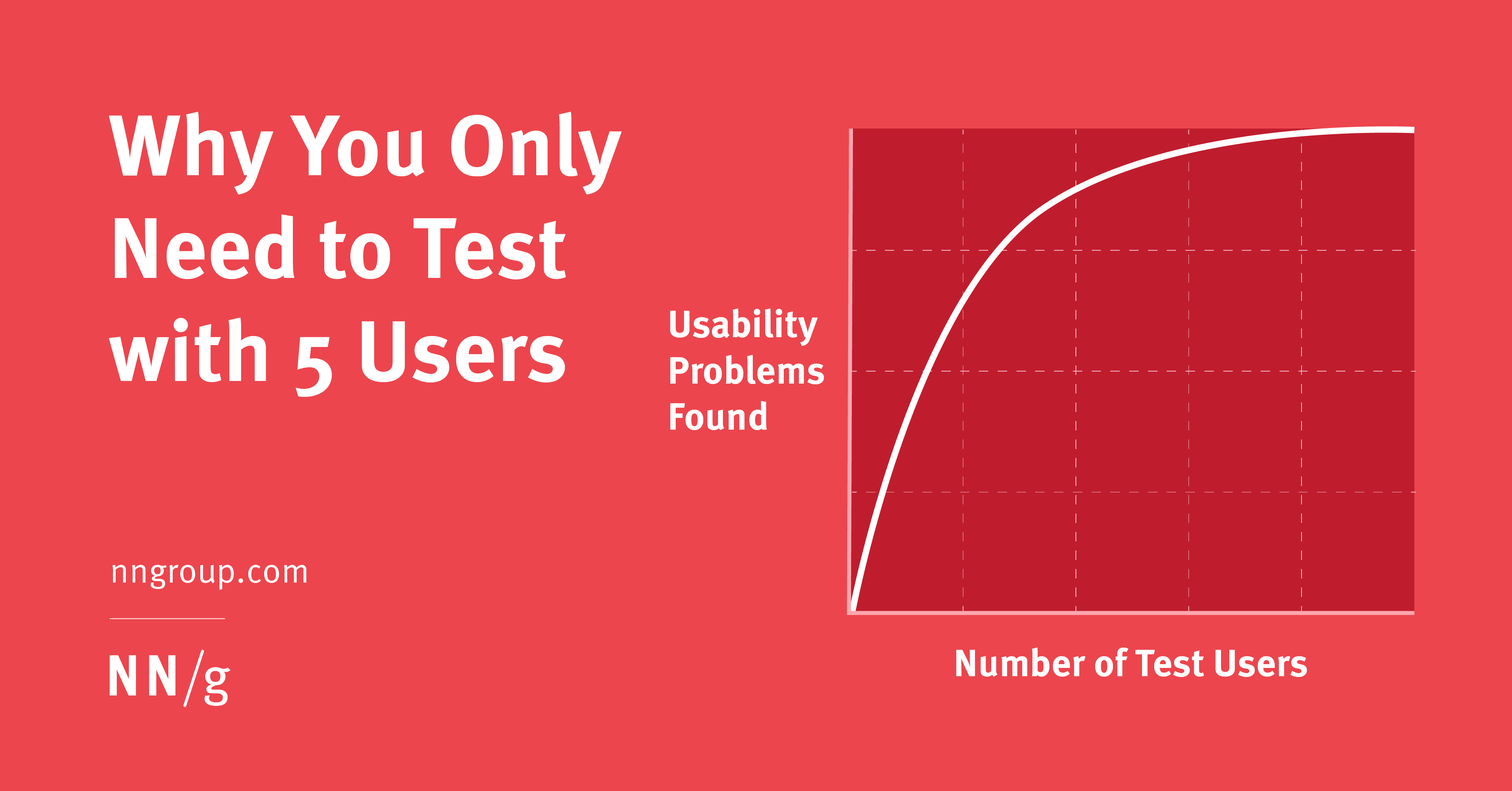
Next: turn notes into decisions in research synthesis.
Related
User research
Interviews that avoid false positives, usability tests with five users, and synthesizing findings. Start here for the map.
User interviews
Recruit the segment in your problem statement, run a 30-minute script that stays in their world and take notes in their words. Five to eight good interviews beat fifty mediocre surveys.
Research synthesis
Affinity-map quotes into observations, insights and ideas — in separate columns. An insight is surprising, grounded in multiple data points and actionable.