Growth and monetization
Retention curves
Three shapes matter — decay to zero, flatten above zero, smile. Flattening is the product-market-fit signal. Compare cohorts, not blended actives.
Plot: x-axis = days/weeks/months since start; y-axis = % of the cohort still active by your definition (opened app, completed a key action, paid seat still active). Compare cohorts over time. If January's D30 is 18% and June's D30 is 26% with the same definition, the product (or the mix of users) improved.
N-day retention vs unbounded retention: "active on day 30" is stricter than "active at least once in days 1–30." Pick one definition and stick to it when comparing. For habit products, activity on the day (or in the week) matching the natural frequency is usually the right lens.
The big idea
Three shapes matter:
- Decays toward zero. Each period fewer users return; the curve slides to the axis. Classic for products with no habit or wrong audience. You do not have PMF.
- Flattens above zero. Early drop-off, then a stable percentage keeps returning. That flat line is your "retained" core — the users who found a job worth repeating. This is the shape you want.
- Smile / improving curve. Sometimes resurrects: win-back, seasonal use or a product that gets better as the network fills. More common in marketplaces and networks than in single-player tools.
Benchmarks are rough and definition-dependent. Use them to sanity-check, not to cargo-cult. Compare against products with the same usage frequency. A tax app with excellent annual retention can look "dead" on a DAU chart.
| Category | Natural frequency | Rough "good" signal (directional) |
|---|---|---|
| Consumer social / messaging | Daily | High D1, meaningful D30 flattening; DAU/MAU often 50%+ for true daily habits |
| Consumer content / utility | Weekly | Solid W1→W4; monthly actives matter more than daily |
| B2B SaaS (seat-based) | Workweek | Month-1 to month-3 logo/user retention; net revenue retention for expansion |
| Marketplaces | Varies by side | Repeat purchase rate within category-typical window (e.g. 30–90 days) |
| Developer tools | Weekly / per project | Return to run builds/queries; seat expansion inside accounts |
Lenny Rachitsky's public retention benchmarks put "great" consumer D30 retention in bands that vary wildly by category. For subscription SaaS, pair user retention with logo churn and net revenue retention (NRR) — see SaaS metrics.
Walking through it
Cohort A (organic, week of Mar 3): D1 55%, D7 32%, D30 21%, D90 19% — flattening near 19%. Cohort B (paid social, same week): D1 48%, D7 18%, D30 6%, D90 2% — decaying to zero. Same product, different audience quality. Fixing B with more onboarding emails will not create the habit A already has; fix targeting or accept that paid is for a different motion.
If new cohorts look worse, you may be buying lower-intent traffic or shipping friction into activation.
Common mistakes
- Reading a blended active-user chart as a retention curve. Lock the cohort denominator.
- Comparing D30 across categories. Social and SaaS do not share a "good" number.
- Treating a smile as proven PMF. Resurrection and seasonality can lift a curve that still has no habit.
Check yourself
- Organic D30 is 21% flattening; paid social D30 is 6% decaying. Same onboarding. What is the diagnosis?
Audience quality, not missing emails. Paid is a different motion — fix targeting or accept the curve.
- What shape is the PMF signal?
Flattening above zero: a stable core keeps returning after the early drop.
Key takeaways
- Flatten above zero for PMF, decay to zero for a miss, smile for resurrection or network effects.
- Compare cohorts with a locked definition and a window that matches natural frequency.
- Same product, different channels, different curves — mix can look like a product regression.
Further learning
What is good retention (Lenny's Newsletter)Although retention is widely considered to be the most important metric to get right when building (or investing in) a business, it’s also one of the least understood. Why? Because unless you’re a growth expert or an …lennysnewsletter.com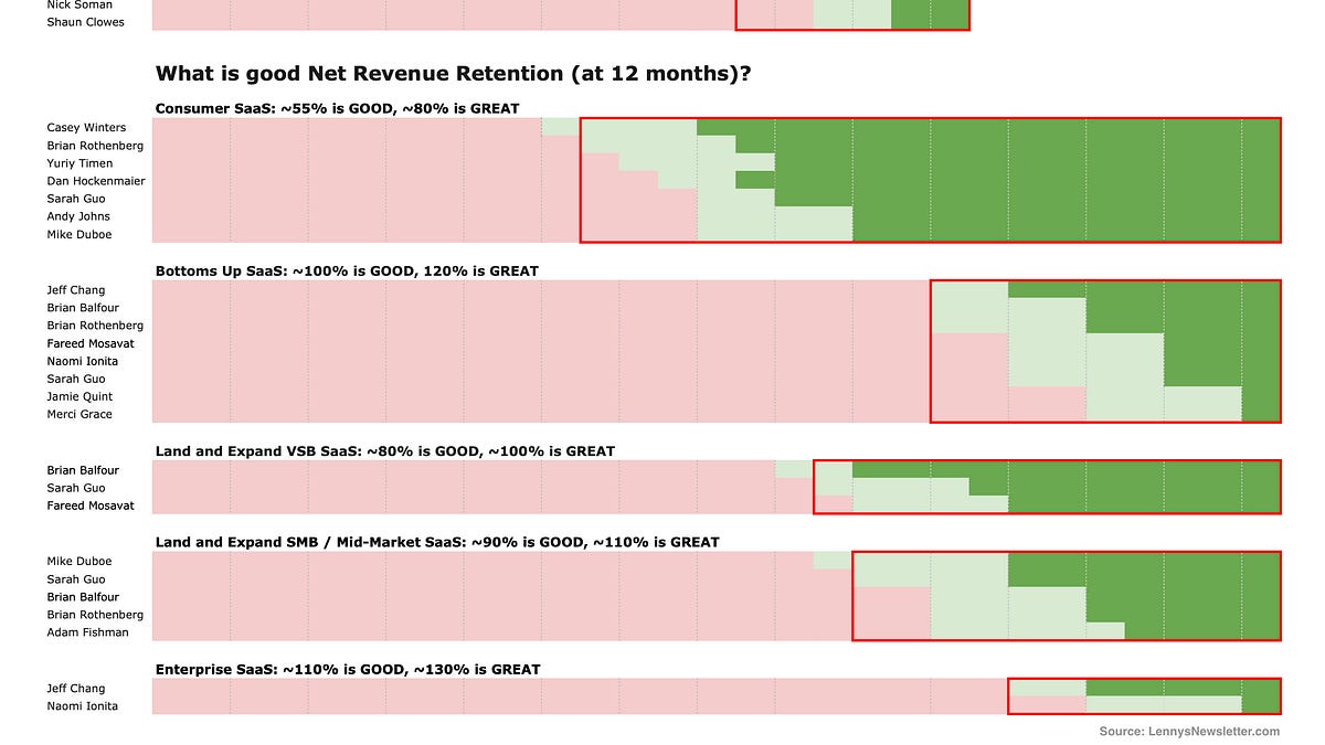
Next on the map: retention.
Related
The leaky bucket
Acquisition without retention only scales the leak. Improving churn compounds; buying more traffic does not change the hole in the bucket.
Retention and engagement
Retention curves, cohort analysis, DAU/MAU and why retention is the foundation of growth. Start here for the map.
Activation and onboarding
Aha moments, time-to-value and onboarding flows that turn signups into active users.