Production and case studies
Designing for AI failure
Assume the model will be wrong. Make correction, undo, partial success and empty retrieval first-class screens, not polish.
Assume the model will be wrong. Design the happy path for recovery. Microsoft's HAX guidelines treat behaviors when the AI is wrong as a first-class design surface. Plan those screens with the same care as the demo path.
Concept
Before you start: calibrated trust is what you want users to feel. Failure UX is the set of controls that make that feeling rational: edit, regenerate, undo, fallback.
The big idea
- Graceful fallbacks. If retrieval is empty, say so and offer search or a human handoff instead of improvising.
- Easy correction. Edit the draft in place. "Regenerate" with optional guidance ("shorter", "more formal"). Thumbs plus a reason.
- Undo. Especially for agents that edit docs or send messages. Soft-delete, draft folders and confirm-before-send are product features, not afterthoughts.
- Partial success. If four fields extracted cleanly and one failed validation, show the four and flag the one. Do not discard the batch.
Users also need levers that match their mental model: editable outputs for anything that leaves the building; regenerate and vary tone or length without restarting the chat; constraints as UI ("reply in ≤100 words"), not only prompt text; stop and cancel for long runs; visible tool use ("Looking up order #1842"). Steerability also means not exposing every model knob. Temperature sliders in consumer UI rarely help. Curated intents do.
A silent five-second wait feels broken. A streamed draft with "Searching docs…" feels alive even if total time is similar. Show the user's message instantly. Stream tokens for chat. For structured forms, stream field by field or show a skeleton with stage text. If an agent will take more than a few seconds, give cancel and partial results. Do not animate fake progress that completes before the server finishes.
Walking through a broken citation
A support copilot drafts a reply with three citations. One citation 404s.
UX: show the draft, mark the broken source, disable "Send" until a refresh replaces it or the human deletes that claim. Blocking send is better than shipping a link to nowhere.
Errors should say what to do next: "Couldn’t verify this against the help center — try rephrasing or ask a human," not "Something went wrong."
AI UIs often ship as chat boxes that fail basic accessibility: focus trapped in the composer, streaming updates not announced to screen readers, color-only confidence states. Announce new assistant tokens politely (or by chunk), keep keyboard paths for regenerate and undo, and do not rely on hover-only citations. Offer "reply in my language" when detection is uncertain.
Common mistakes
- Empty retrieval that still answers. The model improvises. Users cannot tell.
- No undo after send. The agent emailed a customer. Soft-delete and a confirm-before-send would have saved it.
- Discarding a whole form because one field failed validation.
Check yourself
- Retrieval returns nothing. What does the UI do? Say so, and offer search or a human. Do not invent an answer.
- Four invoice fields are valid and
total_centsis not. What do you show? The four, plus a flag on the total. Keep the partial work.
Key takeaways
- Design failure, correction and undo before the launch demo.
- Empty retrieval is a state, not a cue to hallucinate.
- Give edit, regenerate, constraints, cancel and visible tool use.
- Stream real stages. Never fake progress.
- Keep keyboard and screen-reader paths for the same controls.
Further learning
Guidelines for Human-AI Interaction (Microsoft HAX)Best practices for designing AI user experiences What are the Guidelines? The Guidelines are evidence-based best practices for designing your AI user experiences. How do I use the Guidelines? The Design Library helps …Microsoft HAX Toolkit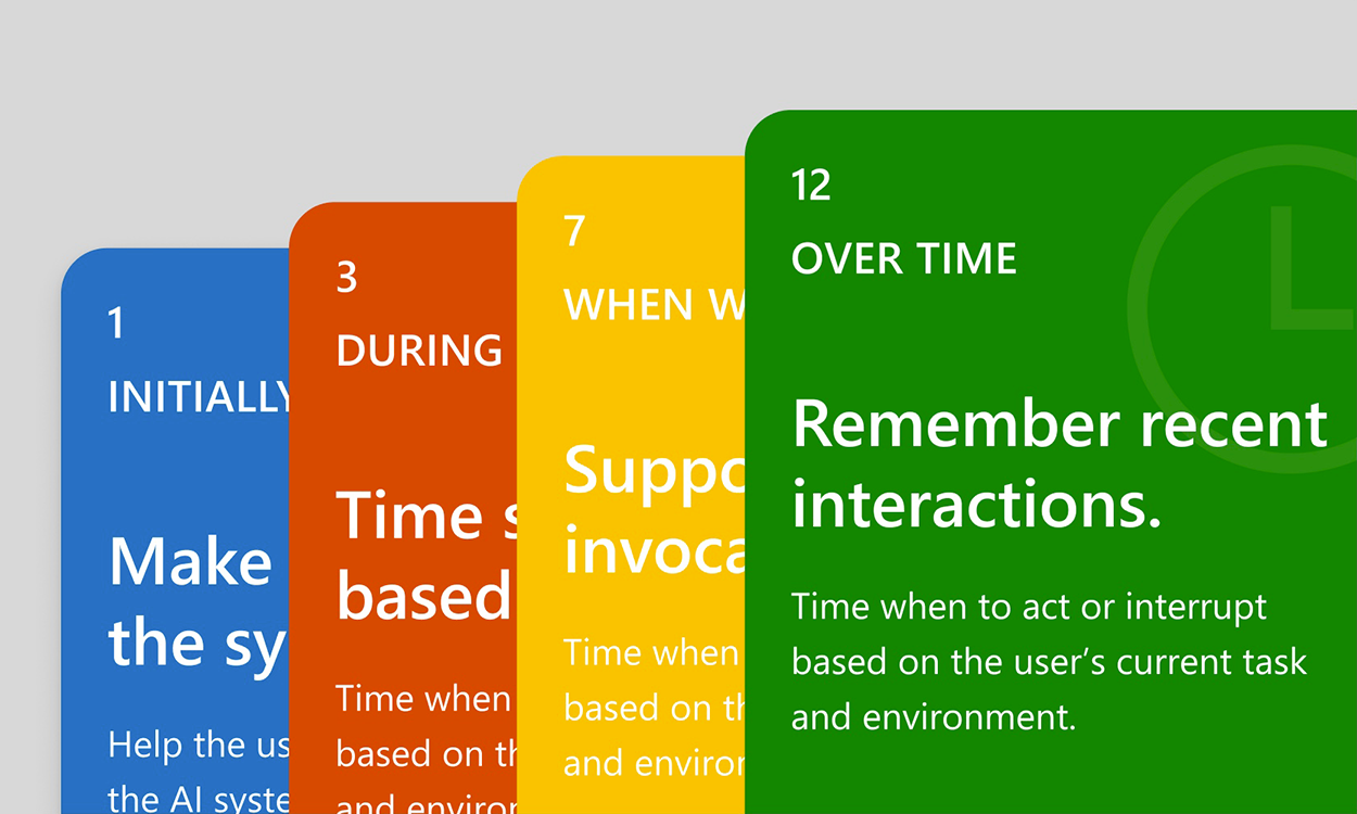
Irreversible actions need a person on the loop. That is human-in-the-loop.
Related
Designing AI product experiences
Interaction design for probabilistic systems: trust, control, failure states and human-in-the-loop.
Calibrated trust
Users over-trust fluent systems. Show limits, citations and honest uncertainty so they rely on the product when it is strong and check it when it is weak.
Evaluating LLM apps
A fixed set of inputs plus a way to score outputs, so you can tell whether a change helped.